I have been working with charter schools on their websites and visual identities for about eight years now. And the thing I come back to, every single time, is this: a homepage that looks good and a homepage that works are not the same thing.
The goal is both. But if I had to pick one, I would pick works every time.
Here is what I mean — and how to get there.
Why Your Homepage Matters More Than Any Other Page
Between 40 and 60 percent of all your website traffic lands on your homepage first. That is the majority of families who are considering your school, arriving at one place, before they have seen anything else.
And when they get there, you have about eight seconds before they decide to stay or go.
Eight seconds isn’t a lot. But it’s enough, if your homepage is doing its three jobs.
Trust. Proving that your school is real, active, and worth a family’s time. This is what keeps people from clicking away.

Differentiation. Showing clearly what makes your school different from every other option available to a family in your area. If a family cannot tell why they would choose you over the school down the street, your homepage is not doing this job.
Conversion. Making the next step obvious. Families who are ready to act can’t guess what to do next. The path forward needs to be visible from the moment they land — whether they schedule a tour, start an application, or get in touch.
What a Struggling Homepage Usually Looks Like
These things show up on school homepages regularly, and they are all fixable:
Stock photos that could belong to any school. Families want to see your actual kids, your actual hallways, your actual community. When they see a generic kid at a generic desk, it does not land. If you do not have a full library of real photos yet, mix real images with stock photos that look natural and unposed — and prioritize getting real photos as soon as you can.
A mission statement that could belong to any school. “We inspire lifelong learners” sounds fine. It also tells a family nothing about what makes your school different. Your homepage copy needs to be specific to you.
A buried “Apply Now” button. The action you most want families to take should be the easiest thing to find. If they have to scroll to find it, some of them will not bother.
Too much text. You have a lot to say about your school. I understand that. But most visitors scan before they read. If your page does not work for skimmers, you will lose them before they get to the parts you worked hardest on.
The 5-second Test
Here is a quick way to assess whether your homepage is doing its job. Pull it up and ask: can a brand-new visitor — someone who has never heard of your school before — answer these four questions within five seconds?
- What grades do you serve?
- Where are you located?
- How do I schedule a tour?
- What makes you different?
If the answer to any of those is “I am not sure,” that is your first fix. And here is a useful signal: if you have to think about it, your first-time visitor will too.
The Anatomy of a Homepage that Works
A strong homepage has a clear structure, and the order matters more than most people realize.
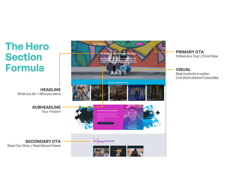
The hero section is everything a family sees before they scroll. It is your most valuable real estate, and it has five components:
Your headline — what you do and who you serve, in one clear sentence. Not a tagline, not a welcome message. Something specific.
Your subheadline — the promise that expands on the headline. What does your school do for families? What problem does it solve? This is where you talk directly to them.
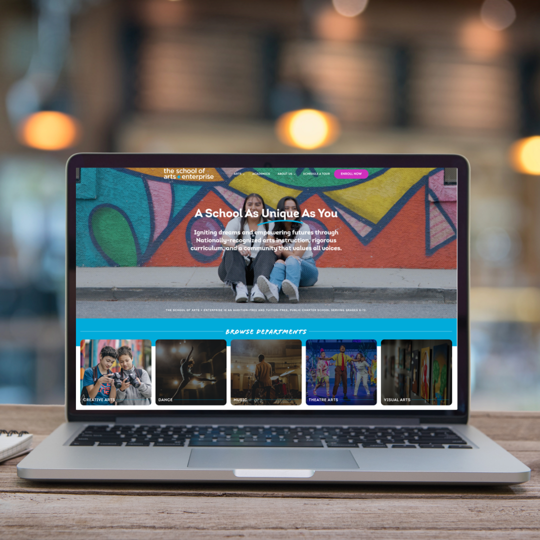
Your visual — real kids in real moments at your school. The goal is to help a family picture their own child there. Stock photos cannot do that.
Your primary call to action — one clear button, above the fold, that tells families exactly what will happen when they click. “Schedule a Tour” or “Enroll Now” — not “Learn More” or “Click Here.”
Your secondary call to action — for families who are not ready to commit yet. “Read Our Story” or “See What’s Happening” gives them somewhere to go without pressure.
Below the hero, the page should flow in an order that tells a complete story:
- Social proof — testimonials, stats, awards — to back up the promises you just made
- Your differentiators — three or four specific things that set you apart
- Programs or curriculum highlights — what will kids actually learn here
- Recent news or events — showing that your school is active right now
- A second call to action — for families who have made it this far and are ready to move
- A footer with all key links, contact information, and social media
Four Types of Visitors — and How Your Design Serves All of Them
Families do not all make decisions the same way. Your homepage needs to work for all of them.
The Scanner is fast and data-driven. They want numbers up front, bullet points, and a page they can move through in thirty seconds. They decide quickly based on facts.
The Gut-Feeler makes a snap judgment based on how the page makes them feel. They need a strong hero image, bold copy, and photos of real human faces. Emotion is their entry point.
The Researcher is thorough. They will read the FAQs, check your credentials, go through your program pages, and come back to your site multiple times before deciding. They want detail and evidence.
The Storyteller needs to feel connected before they can commit. They respond to testimonials, video, and language that explains why your school exists — not just what it does.
A well-designed homepage serves all four. The hero and visual elements serve the Gut-Feeler. The stats and credentials serve the Scanner and the Researcher. The testimonials and narrative copy serve the Storyteller. Every section is doing work for someone.

Mobile is Not Optional
Between 60 and 70 percent of school website traffic is mobile. Families are looking at your homepage on their phones while waiting to pick up their kids, sitting on the couch after dinner, scrolling between other things.
A homepage that looks beautiful on a desktop but is hard to use on a phone is working for less than half of your audience.
What mobile-first design actually requires:
Thumb-friendly buttons. If a button is too small to tap accurately on a phone screen, some families will not tap it. A good rule of thumb: if it feels too small on your phone, it is too small.
Readable text without zooming. If a family has to pinch and zoom to read your homepage copy, you have already lost their attention. Font sizes need to be comfortable on a small screen.
Fast loading. Mobile connections are not always strong. A homepage that takes more than three seconds to load on mobile will lose visitors before they see anything. The most common culprit: large, unoptimized images. Resize and compress before uploading.
A free tool worth bookmarking: Google PageSpeed Insights. Type in your URL and it will give you both a desktop and a mobile score. It is free and takes about thirty seconds to run.

What Your Buttons are Actually Communicating
The words on your call-to-action buttons are small in size and significant in impact.
Words that signal action: schedule, discover, join, start, experience. These tell someone what is going to happen when they click.
Words that do not: submit, learn more, click here. These are passive or vague, and they are easier to skip.
Design matters too. Your buttons need to visually stand out from the rest of the page — high contrast, large enough to tap, consistent styling across the site. On mobile especially, the primary call to action needs to be obvious the moment the page loads. No scrolling required.
On longer pages, repeat your call to action at the top, middle, and bottom. Not everyone reads in order. Make it easy to take action no matter where someone stops reading.
Where to Start
You do not need to do everything at once.
This week: Pull up your homepage on your phone. Is the text readable without zooming? Does the primary button load before you have to scroll? Does it load quickly? Those three things are fast to check and often fast to fix.
This month: Look at your hero section. Is there a real photo of your kids? Is there a headline that says what you do and who you serve? Is there a clear call to action above the fold? Those are the highest-leverage improvements on the page.
This quarter: Plan a photography day. Real photos of your kids, your building, and your campus make an enormous difference and no amount of design work fully substitutes for them. Start collecting short video testimonials. They do not need to be produced — a phone is enough.
Every improvement you make is working for the families who are going to visit your homepage. And it is also, increasingly, working for the AI tools that are recommending schools to those same families. The same things that help a family navigate your page clearly are the same things that help AI read it and recommend it.
That is a good reason to do this work carefully.
Frequently Asked Questions
How often should I update my school website?
Regular updates are key — aim for at least monthly news and key information changes to keep parents engaged and informed.
What platform is best for building a school website?
It depends on your need for control and ease of editing. WordPress offers flexibility, while Wix and Squarespace are simpler for non-tech users.
How do I measure if my website efforts are working?
Track conversions: inquiries, tour bookings, and applications originating from your website; those are the true indicators of success.

Niki Blaker is a Brand and UX Design Consultant who partners with Grow Schools. She has been helping charter schools build websites and visual identities that serve their communities for eight years.