
In today’s competitive educational landscape, the visual materials you create often serve as the first impression families have of your school. Understanding basic design principles can make the difference between materials that get noticed.
The truth is, design isn’t about having an artistic eye or expensive software. It’s about understanding how visual elements communicate and applying proven principles that guide the viewer’s attention exactly where you want it to go.
Color: Your Brand Ambassador
Colors communicate before your words do. In Western cultures, we already associate certain feelings and values with specific colors, making color choice a powerful tool for brand positioning.
Color Psychology in Action
Navy and burgundy convey trust and tradition—perfect for established institutions with decades of history and strong academic reputations. These colors signal stability and gravitas, appealing to families seeking time-tested educational excellence.
Conversely, bright blues and greens signal innovation and energy—ideal for STEM programs, progressive schools, or institutions emphasizing project-based learning and maker spaces. These colors communicate forward-thinking approaches and dynamic learning environments.
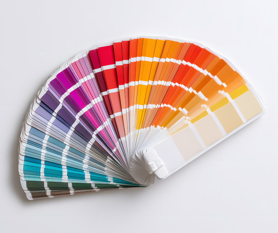
Building Your Strategic Palette
Start by asking: What is your school’s personality? Are you a traditional institution focusing on rigorous academics, or an innovative charter school with cutting-edge programs? Your color choices should align with these values.
Aim for 5-6 colors total: two primary brand colors, two accent colors, plus dark and light neutrals. This gives you enough variety for visual interest while maintaining cohesion across all materials.
Accessibility Isn’t Optional
Once you’ve chosen colors that reflect your values, ensure they work for everyone. Accessibility isn’t just good practice—it’s often legally required. Maintain a 4.5:1 contrast ratio between text and backgrounds. This ensures readability for people with varying vision abilities.
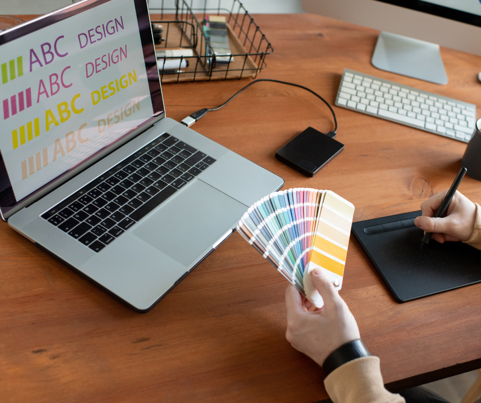
I recommend coolors.co for both generating color palettes and checking contrast ratios. This tool allows you to lock specific colors and suggests complementary options while testing accessibility compliance.
Print vs. Digital Considerations
Don’t forget about format requirements. Digital materials use RGB or HEX values, while print requires CMYK color processes. If you produce significant promotional materials, you may also need Pantone color specifications. Document these equivalents as you build your palette to ensure consistency across all mediums.
Finally, test your colors in real-world conditions. Print them on paper, view them on different devices, and ask staff with varying vision abilities to review materials before finalizing anything.
Typography: Where Small Changes Create Big Impact
Typography might seem like a minor detail, but it’s often where amateur materials reveal themselves. The good news? Small changes here create disproportionately large improvements in perceived professionalism.
The Two-Font Rule
Stick to two main fonts: one for headings, one for body text. Occasionally, a third font for small accents is acceptable, but resist the urge to use more. Font variety doesn’t equal visual interest—it usually creates chaos.
Contrast Is Key
Your typefaces should be sufficiently different in weight and visual density. Apply the squint test: even when you can’t read individual words, you should easily distinguish between headlines and body copy. This ensures clear hierarchy regardless of viewing conditions.
Create Hierarchy Beyond Color
Don’t rely solely on color to establish information hierarchy. Use size and weight differences so your materials work in black and white printing or for viewers with color vision differences.
Helpful Tools for Font Pairing
Use resources like fontjoy.com, fontpair.co, or mixfont.com for pairing suggestions. These tools let you preview font combinations and even lock specific fonts while suggesting complementary options.
Size Standards for Readability
Follow minimum size requirements: 16 pixels for digital materials, 12-point for print. These aren’t arbitrary numbers—they ensure readability across different viewing conditions and age ranges in your community.
Moving Forward With Confidence
Professional design isn’t about artistic talent or expensive software—it’s about understanding how visual elements guide attention and communicate values. By applying these principles consistently, schools can create materials that build trust, communicate clearly, and compete effectively for family attention.
Remember: every visual touchpoint is an opportunity to reinforce your school’s professionalism and values. When materials look polished and intentional, families assume the same care extends to educational programming.
About the Author
Niki is a design expert and visual communications specialist who helps schools create professional, effective marketing materials that support their enrollment and community engagement goals.
Essential Design Resources
Recommended Reading
The Non-Designer’s Design Book
More advanced reading:
Thinking with Type: A Critical Guide for Designers, Writers, Editors, and Students
Designing Brand Identity: An Essential Guide for the Whole Branding Team
The Designer’s Dictionary of Color
Downloading & Pairing Fonts
Adobe Fonts (if you’re already paying for a Creative Cloud subscription)
Free Stock Photo Resources
Color Palette Tools
Premium Design Tools & Templates
About the Author

Niki Blaker is a design strategist and founder of Five Sigma Studio—a design firm focused on bringing brand strategy, user experience, design, and content together. Her work is guided by an emphasis on cross-discipline collaboration and in-depth research that makes meaningful brand strategy and design experiences possible.
Want to share?